
Meep Dive (Mobi-Deep Dive): A Needlessly In-Depth Look at Vancouver's Mobi Bike Share Data
- Tarek Koudmani

- Jun 1
- 11 min read
I love a nice bike ride. Even better, I love a nice bike ride with some stats. I log all my commutes, every fast ride, slow ride, and race. If it happened, it's recorded. As a result I can see my times on every bike ride I've done, going back to 2013. Some people think that's too much. Those people are wrong.
So when I found out that Mobi publishes their full trip log data as open data, I had no choice. I had to go in. Read on for the when, the where, the electrification angle, and finally some really juicy tidbits about the routes people choose.
The Basics of Mobi's Bike Share Data & Ecosystem
Mobi is Vancouver's public bikeshare system, operated in partnership with the City of Vancouver. It lets riders pick up and drop off at any of its docking stations across the city, a network that now spans from UBC to Downtown, and from there down to South Cambie. It's become a critical piece of urban mobility infrastructure, and an increasingly popular way for visitors to see the city at the pace it deserves.
What Mobi publishes, and what makes this analysis possible, is a trip-level dataset covering every single ride taken in the system: the departure station, the return station, the bike type (regular or electric), the membership category, how long the ride took, how far it covered, and the temperature at the time of departure. That's a rich record. Over the three complete years studied here (2023 - 2025) the dataset covers approximately 3.5 million trips. That's a lot of rides, and a lot of signal buried in the noise.
As Go by Bike Week in BC approached, I started thinking about what this bike share data could actually tell us. Not just the obvious stuff, (yes, more people ride in July than February, and yes, Stanley Park is popular), but the more interesting questions underneath: how are people riding, where are they actually going, and what does it look like when you use a routing engine to compare what riders actually did against the fastest possible path between two stations? That last one is surprisingly revealing.
The analysis covers four main threads: the temporal patterns of when people ride (by hour, by season, and by temperature), the spatial patterns of where trips start, end, and what the most popular corridors look like, the growing role of e-bikes in the fleet and how their usage differs from conventional cycling, and finally a directness analysis that uses OpenTripPlanner, an open-source cycling routing engine, to compare observed trip behaviour against the theoretical optimal route. That last piece is where it gets interesting. Spoiler: Stanley Park riders are, quantifiably, not in a hurry.
Let's get into it.
When Do Vancouverites Ride Mobi?
Let's first dive into the temporal aspect to my Meep Dive, because it's the aspect I find debated the most: when do people ride a bike? Let's take a look at the time of day, time of year, and temperature at which people ride Mobi.
Starting with the low-hanging fruit, an hourly breakdown of ridership. This follows a predictable trend, with some peaks around commute hours.
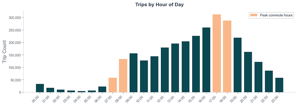
Here we see a slight variation on the classic double hump of the morning and evening commute. What is interesting is just how pronounced that 5-6 pm peak is, and the steady climb in ridership throughout the day until the afternoon peak. More people are ending their workday on a Mobi than starting it. This might feel surprising that 2pm sees more ridership than the morning commute rush, until you remember just how much the ridership profile varies between weekdays and weekends.

Weekdays are all business. That sharp 8am spike and even more dominant 5pm peak tell the story of people integrating Mobi into their commutes: it's infrastructure.
Weekends, by contrast, show an incredibly fluid ramp up and down: ridership climbs gradually through the morning, peaks around midday, and rolls off just as smoothly into the evening. The same city, using the same bikes for completely different reasons.
While breakdown within the day is interesting, when people ride within the year is just as important!

The swing here is dramatic. Over the three study years, July ridership averaged 176,621 trips over the month, this is nearly four times what you see in February (46,662). Vancouver winters aren't exactly brutal by Canadian standards, hence the roughly 1.5k Mobi daily rides seen over the winter months, but apparently they're hard enough to keep ¾ of the summer riders off the saddle. The shoulder months, Spring and Fall, show a smooth ramp, suggesting a variable limit within the population around the conditions in which they’re willing to ride.
Now you might be thinking; “is it really temperature that explains it”?
Yes. Emphatically, yes.

The correlation between average departure temperature and daily ridership sits at r = 0.909. That's not a relationship, that's basically a rule. For every degree warmer it gets, more people are jumping on a Mobi bike. When incorporating the R2 into the results, it shows that temperature alone accounts for nearly 83% of the variation! While there’s always outliers, some cold days punch above their weight, some warm days underperform, but the trendline is about as clean as you'll find in real-world behavioural data.
Where Do Riders Go, And How Has the Fleet Evolved?
Now that we know when people ride, the natural next question is where. The Mobi station network spans most of Vancouver's urban core, but the data reveals some striking concentrations.


In the world of Mobi, the Stanley Park - Information Booth station stands alone. With 88,158 departures, nearly double the next closest station, it is the big fish in the Mobi pond. However, it is part of a broader pattern, four of the top five departure stations are in Stanley Park. Before we even get to the spatial analysis, the data is already telling you something obvious: a huge portion of Mobi usage is recreational, and Stanley Park is the centre of it.

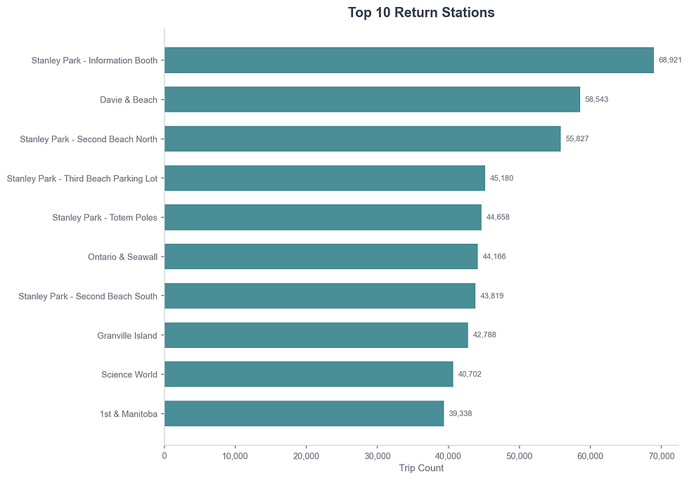
The return picture is broadly similar, with one notable shift: Davie & Beach climbs from third to second on returns, and the gap between Stanley Park - Information Booth and the rest of the network compresses considerably (68,921 returns vs 88,158 departures). That net outflow from the Information Booth station is a signal, more trips start there than end there, meaning riders are flowing out into the park and returning via the other Stanley Park stations rather than looping back to where they started.

To really drive home the point, this chart is the clearest expression of the recreational versus utility split in the entire dataset. Stanley Park - Information Booth logs 32,246 round-trips, more than triple the next station. The top nine round-trip stations are all Stanley Park or beachfront locations. From a planning lens, this is highly important in that recreational trips and transportation trips place very different demands on a bikeshare network, and on cycling infrastructure. Utility-focused riders tend to value directness, reliability, and integration into commuting corridors, while recreational riders gravitate toward scenic routes, comfortable infrastructure, and loop-style experiences. In many ways, Stanley Park, and the seawall generally, functions almost like a parallel use case within the same system, less as an urban transportation network, more like a recreational cycling amenity. Understanding that split is critical when interpreting ridership patterns across the broader network, because not all trips are trying to solve the same problem.

The net flow map above separates the commuter network from the destination network in a way raw counts can't. Stanley Park - Information Booth is the largest net exporter in the system (+19,237), joined by a cluster of West End stations along Bute and Davie that are likely serving as launchpads for morning commuters arriving downtown. On the inflow side, Morton & Denman (+16,643) and Stanley Park - Second Beach North (+12,347) are absorbing bikes, these are the destinations, the places people are actually trying to get to. For anyone thinking about rebalancing operations, this is likely where you're starting (👀).
The Electrification of the Fleet
Before we go deeper on routes, allow me this little detour to take a look at the role of e-bikes in the Mobi fleet.

E-bike trips have grown substantially month-over-month since Mobi introduced them, but interestingly, the seasonal pattern is opposite to the overall ridership curve. E-bikes see their highest usage rates relative to total ridership in the winter, and the lowest in summer. However, the rate of use keeps rising year over year.
Now, remember when we looked at the correlation of number of trips and temperature? If you’re like me, you were probably wondering if that changes between e-bikes and regular bikes. Does the allure of a motor assisting you along help people tough it out even when the temperature is down?

The answer is a little bit! Both bike types show a strong temperature correlation (r = 0.908 for regular, r = 0.859 for electric), and those correlations explain a meaningful share of the variation in ridership (R² = 0.825 and 0.738, respectively). However, e-bike ridership is less correlated with the temperature, which might suggest that either the speed, or convenience of having an e-bike might be moving the needle in getting people on a bike, regardless of the temperature. Or possibly, trips occurring on e-bikes are more purpose driven than those on a regular bike. They're not hopping on because it's a gorgeous Saturday afternoon, they're getting somewhere, rain or shine. That distinction becomes important when we look at where people are going.

Overall, Mobi trips declined year-over-year between 2023 and 2025, with total ridership dropping by roughly 35,000 trips between 2023 and 2024, followed by another ~70,000 decline in total trips between 2024 and 2025. At the same time, e-bike usage continued to climb steadily, growing from 28.4% of all trips in 2023, to 34.2% in 2024, and reaching 36.6% in 2025. In absolute terms, e-bike ridership also increased year-over-year, despite the broader decline in total system usage. Altogether, that represents a gain of more than 8 percentage points, or roughly a 28% relative increase in mode share over just two years.
The obvious variable hanging over these trends is the arrival of Lime scooters into Vancouver’s micromobility ecosystem, and the general uptake of personal electric scooters. While the datasets here cannot directly attribute ridership shifts between systems, the timing is difficult to ignore. Anecdotally, Lime scooters appear to be absorbing a portion of trips that may previously have been made using Mobi bikes, particularly for shorter, lower-friction point-to-point travel. As Lime continues expanding its operational footprint across Vancouver, this modal shift toward lighter, more flexible electric micromobility options may continue. Of course, this is an intersection of inquiry ripe for more detailed analysis. Maybe in a future blog post?

Delving further into the differing use cases between bike types, Mobi e-bike riders consistently cover slightly more ground per trip than conventional cyclists, with a median trip distance of 2.3 km compared to 2.1 km for regular bikes. More notably, they do it faster, completing those trips in a median of 10.6 minutes versus 11.4 minutes for conventional bike users. On the surface the differences appear modest, but together they point toward a fairly distinct travel behaviour pattern. E-bike riders are not only replicating conventional bike trips with a bit of electric assist layered on top. They appear to be travelling with more intent, taking on slightly longer trips while minimizing the time cost typically associated with added distance.
Put differently, e-bikes seem to be unlocking a different category of trip altogether. These are trips that may previously have sat just beyond the threshold of convenience for many riders, whether due to distance, elevation, or simply the desire to avoid arriving sweaty. The combination of an 11% increase in trip distance alongside a roughly 7% reduction in trip duration suggests riders are simultaneously travelling farther and moving faster. That pattern aligns closely with broader trends observed across North American micromobility systems, where e-bikes increasingly function less as recreational cycling infrastructure and more as practical urban transportation tools.
Top Routes
Alright, we’re back. ROUTES!!!
If you’re still here at this point, and reading diligently, you may guess that the top routes chart would show a lot of Stanley Park oriented routes. And you would be absolutely correct. 14 of the top 15 most popular station-to-station routes involve Stanley Park. The Info Booth to Totem Poles leg alone has been ridden nearly 10,000 times. Given that we have driven the Stanley Park point home with vigour, take a look at the interesting patterns that emerge when we exclude Stanley Park stations.
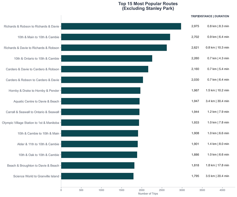
Stripping out Stanley Park entirely reveals the everyday utility network underneath and around the tourism and leisure network. These are shorter trips, tighter geographically, and, critically, these are the routes where e-bike adoption probably has the most practical impact. A commuter doing the Smithe & Burrard to Dunsmuir & Beatty leg every morning cares about reliability and speed in a way that a leisure rider looping the seawall simply doesn't.
To get a clearer picture of the difference between Stanley Park rides and all other rides we can look at the “directness” of a route. To do this I took the median route length (km) and duration (min) for every route in the data, and then, again this is a deep dive, compared these median’s against the calculated estimates of route times using OpenTripPlanner (OTP), an open source routing engine that can calculate trips using walking, transit, and you guessed it, cycling as a mode of transportation. Then all you have to do is compare the median data from the trip logs against the estimated OTP numbers to deduce how far out of their way are people going along these routes. Simple!

The directness comparison quantifies what most of us already intuitively know: Stanley Park riders are not in a hurry. The median Stanley Park trip has a distance ratio of 1.22× the shortest possible route; riders are taking 20% more distance than necessary to get between stations. For non-Stanley Park rides, that figure is essentially 1.0× (neutral). People riding to work take the most direct possible route. People riding in Stanley Park take the scenic one.
The time gap is even more pronounced. Stanley Park trips run at 1.49× (~50% longer) the expected travel time, nearly 7 extra minutes above what OpenTripPlanner would estimate for the same route. Non-Stanley Park rides actually come in under estimated time (0.90×), which suggests purposeful riders are moving efficiently and directly. The park's infrastructure, the Seawall, the winding paths, is doing exactly what it's supposed to do. Now the data can tell you how much of a wander that actually is.

The most meandering routes in the network stretch to distance ratios above 100×, meaning riders covered over 100 times the straight-line distance between stations. While the very top offenders here are not in Stanley Park, this actually highlights the false dichotomy implied throughout this post, where we've equated tourist and leisure rides with Stanley Park rides. Those top three rides, while not in Stanley park and not technically a loop to and from the same station, are all ending at a station within 100m of the starting point. The length of rides taken between these stations implies that these are the most heavily used leisurely rides. Meandering isn't exclusively a Stanley Park phenomenon, but the park is very good at inspiring it.
Distance is one lens, time is another. And yet, they're telling the same story.

Similarly, to a distance measure the routes with the most extra time above OTP estimates show a fairly balanced distribution of Stanley Park and non-Stanley Park trips. Some of these trips are running 50+ minutes over the navigation estimate, a nice leisurely pedal, not a commute, an afternoon. Like we discussed above, this shows that leisurely rides can originate from anywhere within the Mobi network, exactly why it’s become such a popular sightseeing tool.
So what?
So.. Everything!
Three threads ran through this data, and they all point the same direction. First: Mobi ridership is deeply weather- and season-driven, with temperature explaining an extraordinary amount of the variance in daily trips, but e-bike riders seem to be slightly less tied to riding in ideal conditions. Second: the Mobi network has a clear recreational layer, concentrated in Stanley Park and the seawall, sitting on top of a utility layer concentrated in the downtown core and inner neighbourhoods, and that utility layer is becoming increasingly electrified. Third: directness metrics give us a genuinely useful lens for separating those two worlds, quantifying the difference between a commute and a meander in a way that raw trip counts simply can't.
There's plenty of natural next chapters here too: how does Mobi fit into the last-mile picture around SkyTrain stations? Edge-station ridership — are stations at the edge of the network experiencing outsized demand from residents living just outside the zone? To what degree is Lime just absorbing Mobi rides, or is it generating its own new trips as well? The list goes on. That's analysis for another day, and probably another needlessly long blog post.


Comments